


ICS-translate - Redesigning a Translation Agency's Website
Ever visited a website or mobile app and found it difficult to use? Have you ever felt that you need a degree just to navigate from A to B, or to complete a basic function like submitting a form to register your interest? If so, you’ve been a victim of poor user experience (UX) design. The purpose of a website is not to test the patience of the user, nor is it to make the user feel lost in a complex rabbit hole of pages. Rather it is to aid the user in their pursuit, making every possible outcome accessible to them in as few clicks as possible.
It is more important than ever for companies to invest in their website’s design as it can…
- Improve accessibility
- Save businesses time and money
- Help businesses stay competitive
- Convey brand personality and uniqueness
Being a business prideful of our design service line, this makes us hyper-focused and, admittedly, exceedingly critical of our own digital products. For this reason, at ICS we decided it was time to take a step back and look within to how we’re presenting ourselves to potential clients. Embarking on a substantial redesign of our very own ICS-translate website, that would last a little over 6 months, it was time to get to work!
Design auditing
First, we sat down as a team to conduct a design audit of the previous site. A design audit is essentially an analysis of all visual and technical elements of a website (or digital product). It was important here to be critical, narrowing down our search for key user interface (UI) principles: branding, usability, site architecture, content, and some SEO basics to round it off.
We found ourselves at a crossroad after conducting the audit. We had to remind ourselves of our priorities, ensuring we didn’t sacrifice functionality for aesthetics and that the user is at the forefront of any decision made. After asking ourselves “what goals of the user are we considering?” we identified the following as key areas to target within the project:
- Conversion
- Lead generation
- SEO improvements
Having identified our targets we were able to map out a trusty 6-month roadmap. This was to ensure each phase of the project was documented, also allowing us to track progress against our objectives.
Kicking off the design process - Building out a complex design system
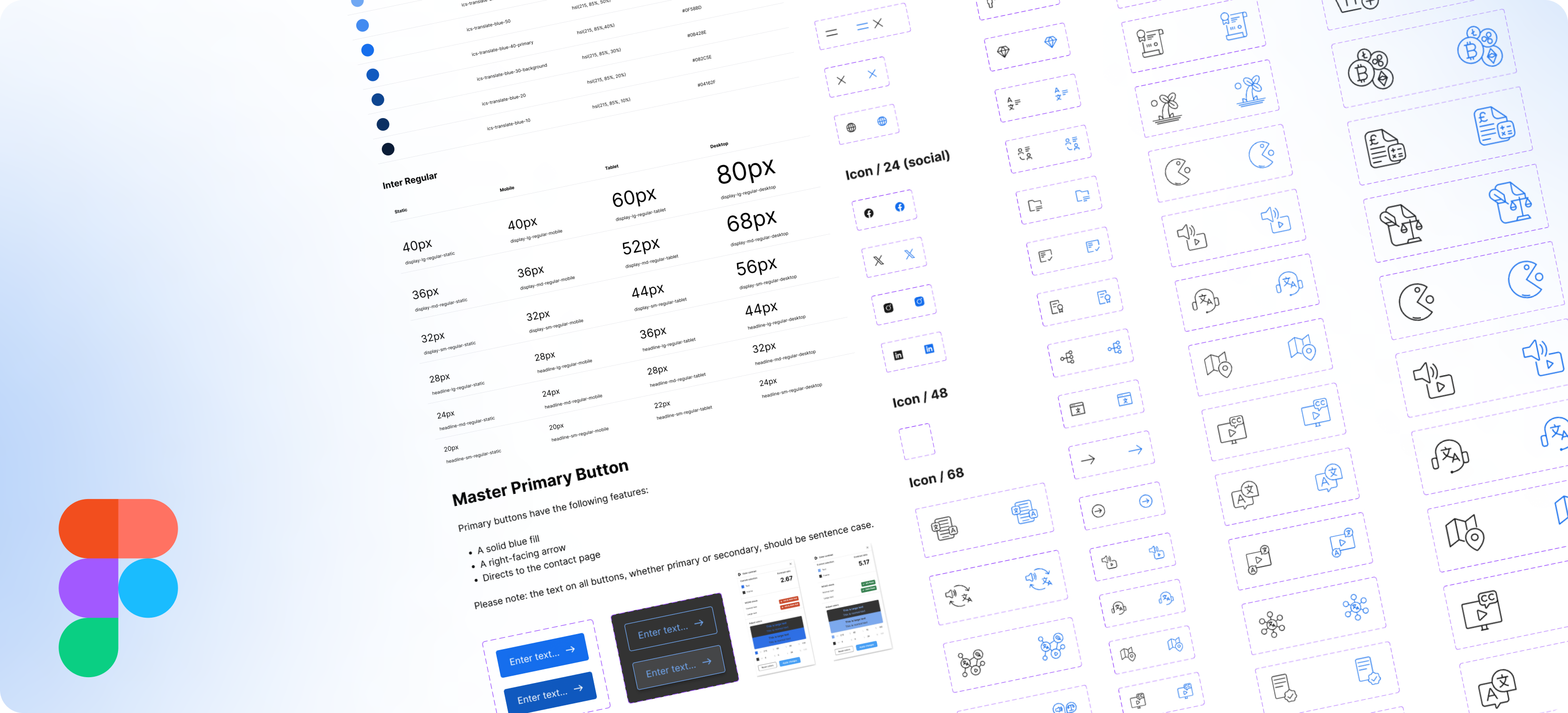
Opposed to jumping straight into designing the end-product, a methodical approach was required from the offset. This meant that the first step required was to put together a design system, which fundamentally underpinned the design stage of the project.
So what is a design system? By definition, it is a collection of reusable components, guided by clear standards, that can be assembled together to build any number of applications - Marco Suarez, Design System Handbook. Think of it as the foundation of which you lay building blocks on. Having a strong foundation ensures that no cracks begin to form later in the design process. We take a thorough approach to creating design systems at ICS, to ensure order and consistency to our (and our clients) digital products.
Building out a new design system increased the speed and efficiency when working on this project. Having a library of styles to refer to more than halved our workload, enabling us to pile resource into other areas and not get overrun whilst still maintaining client projects too. This library consisted of:
- Typography
- Colour palettes
- Spacing rules
- Grid layouts
During this phase, we also built out a complex component set in Figma (design software), which housed assets and their corresponding variants. These assets consisted of: logos, buttons, icons, graphics/illustrations, cards and containers. Having this component set meant we were able to drop these into the page design an infinite amount of times, with the knowledge that there will be 100% consistency throughout the project. For each component set, an accompanying variant was made to cater for mobile responsiveness which is becoming increasingly important, as well as colour to improve accessibility.
On reflection, the answer as to why this stage requires particular attention is simple. To prevent chaos. Different button sizes, random icon weights, hundreds of colour shades, not to mention text styles across different screen sizes. For the user that might not sound like a problem at all, but the designer will say differently.
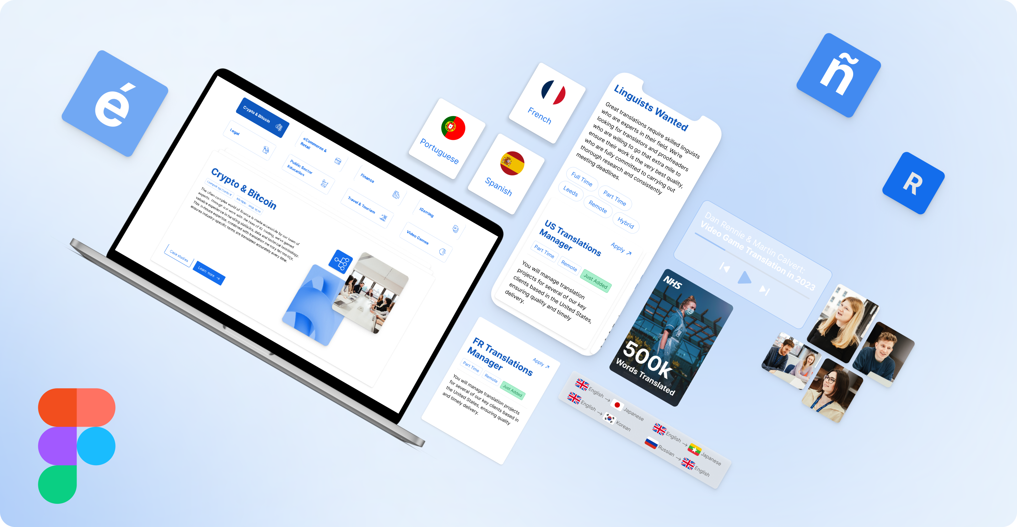
Visualising the design - Constructing hi-fidelity wireframes
With the design system concluded, it was time to get our hands dirty and start wireframing.
For those who aren’t aware, wireframing is like creating a blueprint for a building. It helps designers define the structure, layout, and flow of a user interface.
During this phase of the project, we were faced with the challenge of striking a balance between aesthetics with usability. Having the project lean in the favour of aesthetics could have been detrimental to the overall usability of the site, therefore hampering the users experience. Whilst a lack of aesthetically pleasing UI may make the site appear dull, outdated, hence not able to captivate the user.
It was important to keep aligned with our project goals to ensure we didn’t veer in the wrong direction. One of the core objectives, to improve conversion rates, saw us place more emphasis on user navigation during the wireframing stage. Navigation should be instinctive, and present the user with what they want to see, not test them of their patience. We saw that CTA’s directing the user to the contact page were strategically placed throughout the site, and it doesn’t end there. Ensuring that the contact form is intuitive for the user to submit is the other half of the challenge.
We made sure to pay particular attention prototyping the wireframes in an attempt to bring the static designs to life. Using prototyping tools in Figma, we were able to set interactions on elements that would best demonstrate how the end product would look and feel once developed. This was particularly beneficial when pitching designs to internal teams, such as SEO and Content, to keep them updated on progress, whilst receiving tailored feedback specific to their fields.
Development - Bringing the design to life
Next up, it was time to move onto developing the newly designed website. We opted to build the site using the popular no-code page builder, Webflow. This software is a fantastic tool for creating bespoke custom websites without the need to write code. It provides a visual editor, pre-made templates, and hosting features that saves on valuable time and resources.
Due to the code-free nature of Webflow, a traditional dev handover was not required. Usually, in order to save time for our colleges in the development department and to ensure a smooth delivery process from Design to Dev, it is crucial to take a thorough approach in sharing design files. In this instance, however, no handover was required, rather a couple of tweaks to our working design files ensured that:
- Appropriate naming conventions were used
- Units were consistent (e.g. px, rem)
- Font styles were detailed
Throughout the development process, we had to be aware of how the site would be perceived across different devices. Thankfully, Webflow employs a visual approach to responsive design, enabling us to manipulate layouts and elements for different screen sizes. The ability to set styles, positioning, and interactions specific to each breakpoint ensured a seamless and tailored experience across devices.
We also knew it was important to make the new site a shared platform, accessible to employees who may wish to add content in the form of blog posts. Weblfow’s powerful content management system (CMS) allowed us to build a backend that catered for this, portraying the site as a communal space for all to dynamically add content, rather than a scary heap of code that can only be edited by developers.
Site launch - Conducting post-launch analysis
At last we were able to launch phase 1.0 of the site. We’ve spent a little over 4 months planning, building and refining the digital product and now’s the time to release it to the world. But that’s not where this story ends. Now’s the time to take stock, review, and install strategies to ensure the launch was a success.
Software such as Google Analytics were helpful in sorting through user interactions. Monitoring traffic and patterns gave us an initial insight and assured us that things were on track:
- Total keyword rankings increased from 301 to 420
- Top 20 keyword rankings increased from 10 to 51
- Six-fold increase in organic traffic
- Page 1 ranking for 'translate leeds', 'video translate service', 'translate company' and 'audio translations'
The initial results seen could mainly be credited to the efforts of the SEO and content teams. Well-optimised content, including relevant keywords, meta tags, and structured data, all contributed to enhancing the website's ranking, driving organic traffic and improving overall performance. Thoughtfully crafted content not only contributed to SEO but also helped in engaging our visitors, keeping them on the site for longer. On top of this, a 20% increase in form submissions saw that further UX efforts did not go to waste.
Looking ahead
Interface design is in a constant state of evolution, shaped by technological advances, changing user behaviours, and design trends. Mobile platforms, touch interfaces, and voice interactions have added new dimensions, while accessibility and inclusivity are now central considerations. It is for this reason why we strive to stay ahead of the curve, ensuring that new factors are catered for, whilst still adhering to business requirements which may inform adjustments to the site offerings and functionality going forward.
Unsure on how to get the ball rolling for your website redesign? Our team of SEO, UX and design and development experts at ICS-digital are here to help.
Get in touch to find out more about how our digital experts can guide you on the path to online success.


